In 2017, sending an Alexa Announcement felt like magic; a simple “Dinner’s ready!” echoing through the house. By 2023, that magic began to fade. What once felt effortless now felt limited.
I joined the Communications team to reimagine how Alexa could help households reach the right people, at the right time, in ways that felt more personal and fun.

The existing mobile Announcements experience made it easy to broadcast a message to everyone, but difficult to reach someone specific. It lacked the flexibility, personality, and control customers increasingly expected from Alexa. The design also became difficult to scale; limiting our ability to introduce new tools and delight customers who relied on it daily.
Our challenge was to redesign a beloved feature that could bring expressiveness, targeting, and simplicity together in a way that still felt natural to use.
THE OPPORTUNITY

Scale from simple "blast to all" messages to more personalized, targeted communication
Introduce new expressive tools like avatars, sound effects and filters that make messages feel alive

Preserve speed and simplicity, especially on mobile's limited real estate

Version 1.0 designs
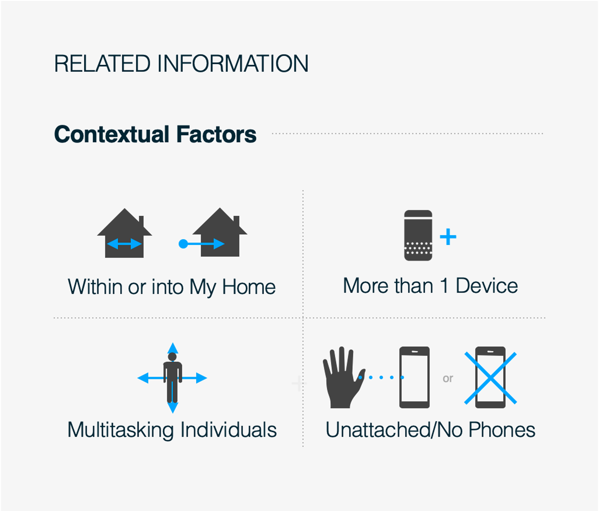
We started with a simple goal: make everyday communication effortless. Parents told us they wanted faster, more reliable ways to reach everyone at home; without needing to repeat themselves or hunt through menus.
Sometimes kids “don’t hear” a drop in or announcement so the (often tired) parent needs to repeat themselves several times or until the child does what they’re told.
“I made an announcement that said that it was time for the boys to start getting ready for bed… they ignored me and so I had to do it multiple times.” - Amber, mom of 2, Goals and Contexts Report (Q1 2022)
Research Showed:
These patterns revealed clear opportunities: simplify repetitive tasks, make self-expression easier, and surface playful elements without sacrificing speed.

We explored a range of concepts. From subtle UI updates to bold rethinks. We evaluated the concepts in design critiques and tested them across multiple rounds of design reviews and usability studies.
.png)
Ideas were consolidated, feedback was implemented from stakeholders and product partners, and concepts were chosen for testing with internal customers. Listed below are brief descriptions of each concept and high level feedback we received from stakeholders.

Mild concept: Uses standard design system elements.
✔️ Positive feedback from stakeholders on quick suggestions and personal avatar.
❌ Concerns about quick suggestions in absence of user data.
❌ Sound effects are hidden behind a menu, degrading the current experience.

Medium concept: All Announcement features easily accessible upon launching the experience
✔️ Positive feedback on scalability and discoverability of features through tiles.
❌ Stakeholders want a more integrated approach with quick suggestions, but were okay to test this concept with customers.
❌ Potential risk of customers not drilling into the menu (e.g. sound effects).
.png)
Wild concept: Strong point of view on how and why customers should use Announcements
✔️ Positive initial reception, but cautious.
❌ May not align with current needs of Announcement customers who are on-the-go.
❌ Could not test with customers due to time constraints.
I created prototypes after vetting the models thoroughly, and carried out a in-person A/B study in February of 2023. 6 participants completed the study.
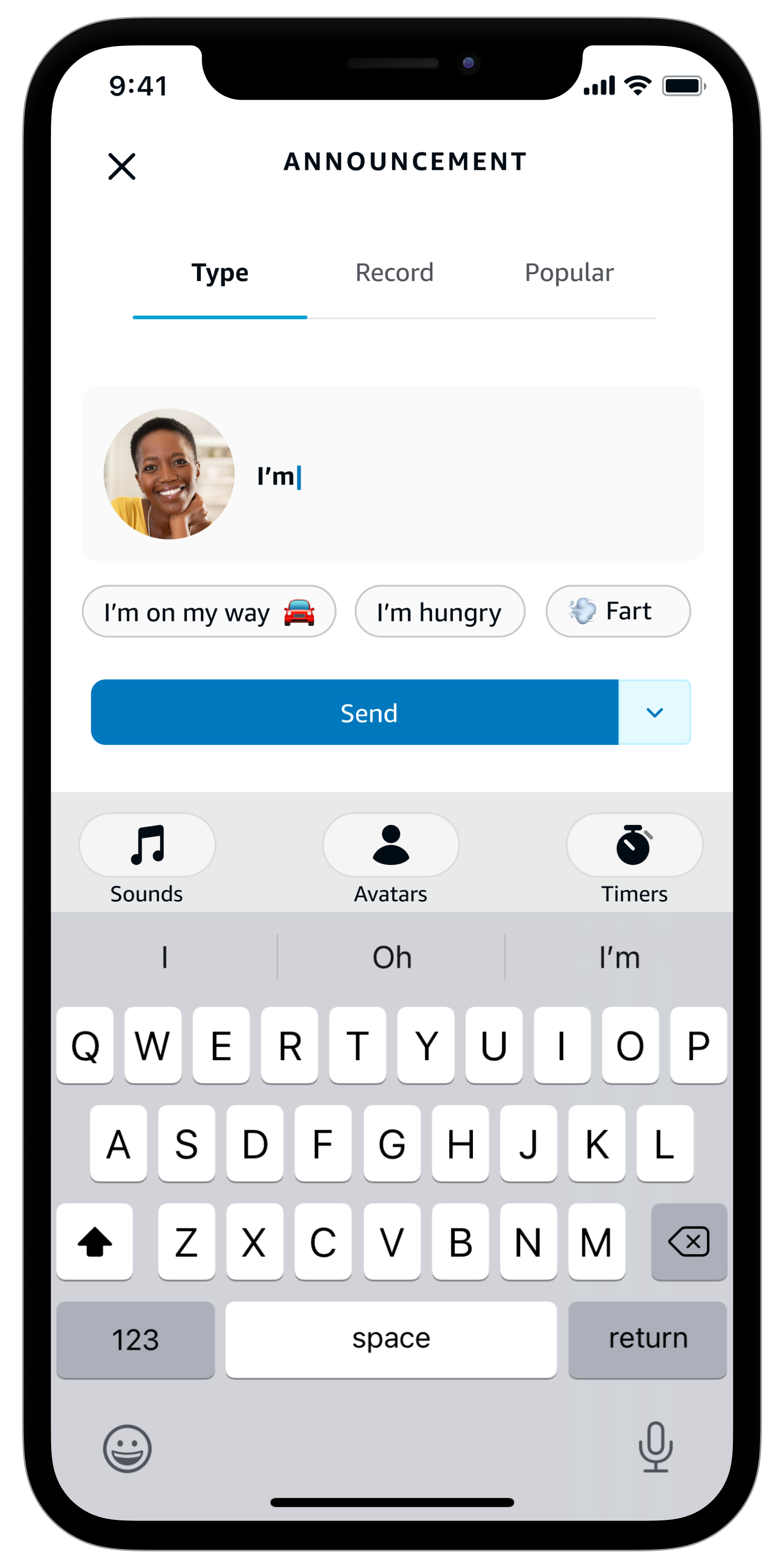
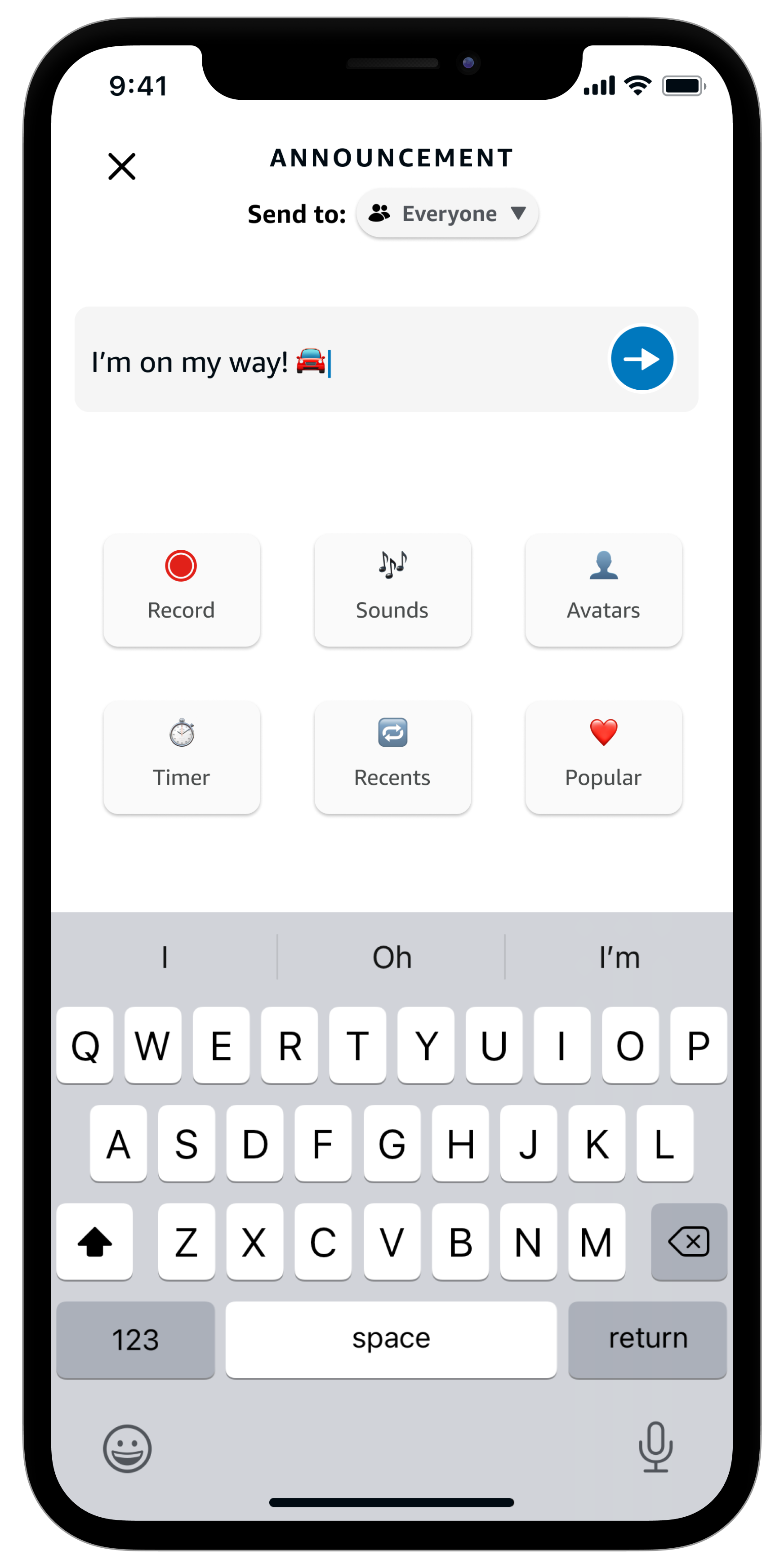
I compared task performance and preference between two models (Option 1: Modes and Option 2: Features All Up imaged below) with the existing experience. I did this to ensure we weren't degrading parts of the existing experience with the new designs.
.jpg)
.jpg)
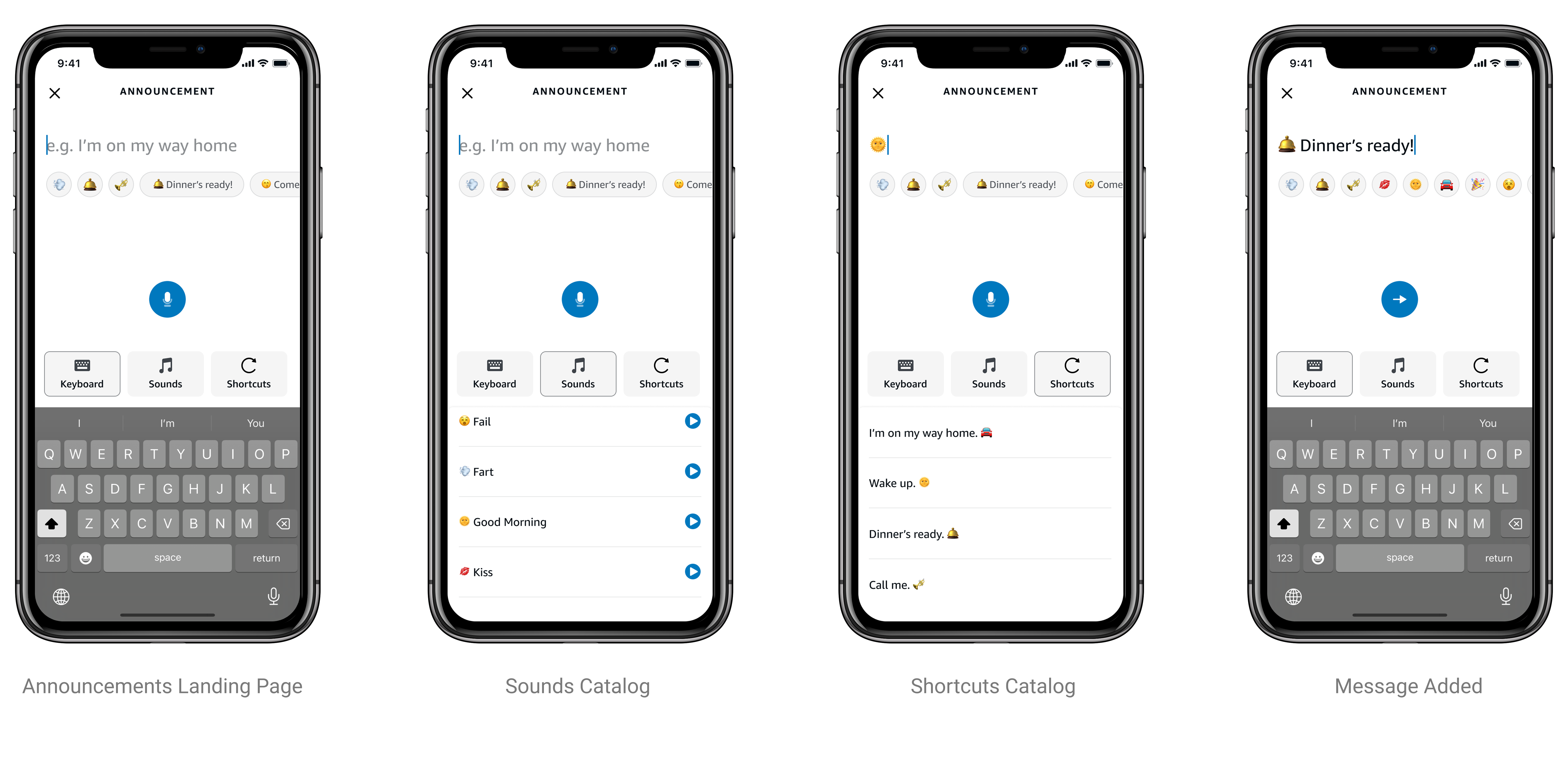
Option 1 let users switch between typing, recording, or using popular preset messages, and offered helpful suggestions as they created their announcement.
.png)
What tested well?
Why didn’t it work?
“I don’t like that I have to make this additional tap to get to record or popular.”
Option 2 showed all announcement tools in a grid menu, with users needing to close a suggestions panel before creating their message.
.png)
What tested well?
“I don’t have to navigate across different tabs. I can select one right here. And the ability to choose the person you want to send it to from the home screen itself.”
“It has the ability to send messages to a particular person and to everyone. All the capabilities that the announcement feature has, recording to sending some sounds to sending a popular message so it has everything you need to make an announcement effective."
What didn't work?
“Every time I need to make an Announcement, I have to dismiss this drawer. I can see the features behind the list, but the animation of the drawer coming up is frustrating.”
Based on user feedback, we combined the best parts of both test designs into a final version that makes announcements easier to use while adding new features, with the team agreeing to move forward with the grid-style layout.
The design keeps basic announcements simple while making fun features easily accessible, adds personalization through avatars, speeds up daily communication with smart suggestions, uses familiar mobile patterns, keeps all tools visible, and can grow to include more features in the future.
.gif)
By working closely with Product to show how our design met customer needs and solved future scalability issues, we gained strong support for the project. This led to two next steps: creating a comprehensive roadmap presentation for leadership and developing a minimum lovable product (MLP) for release this year.

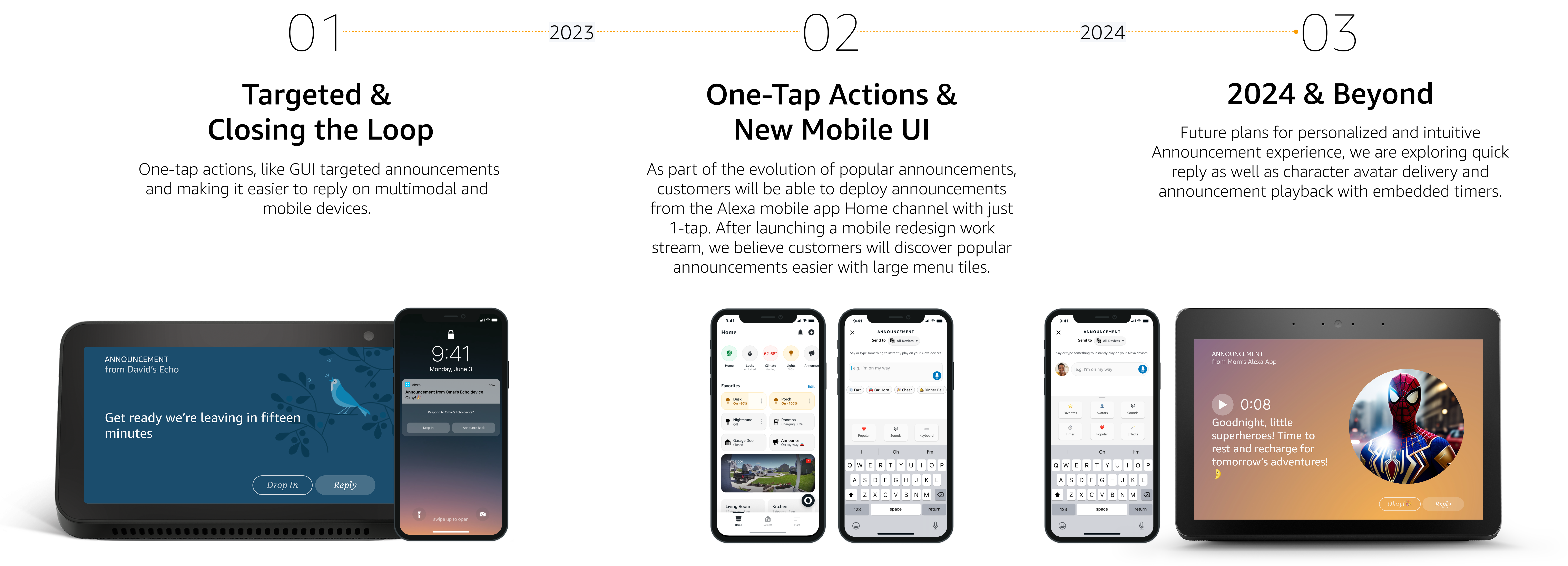
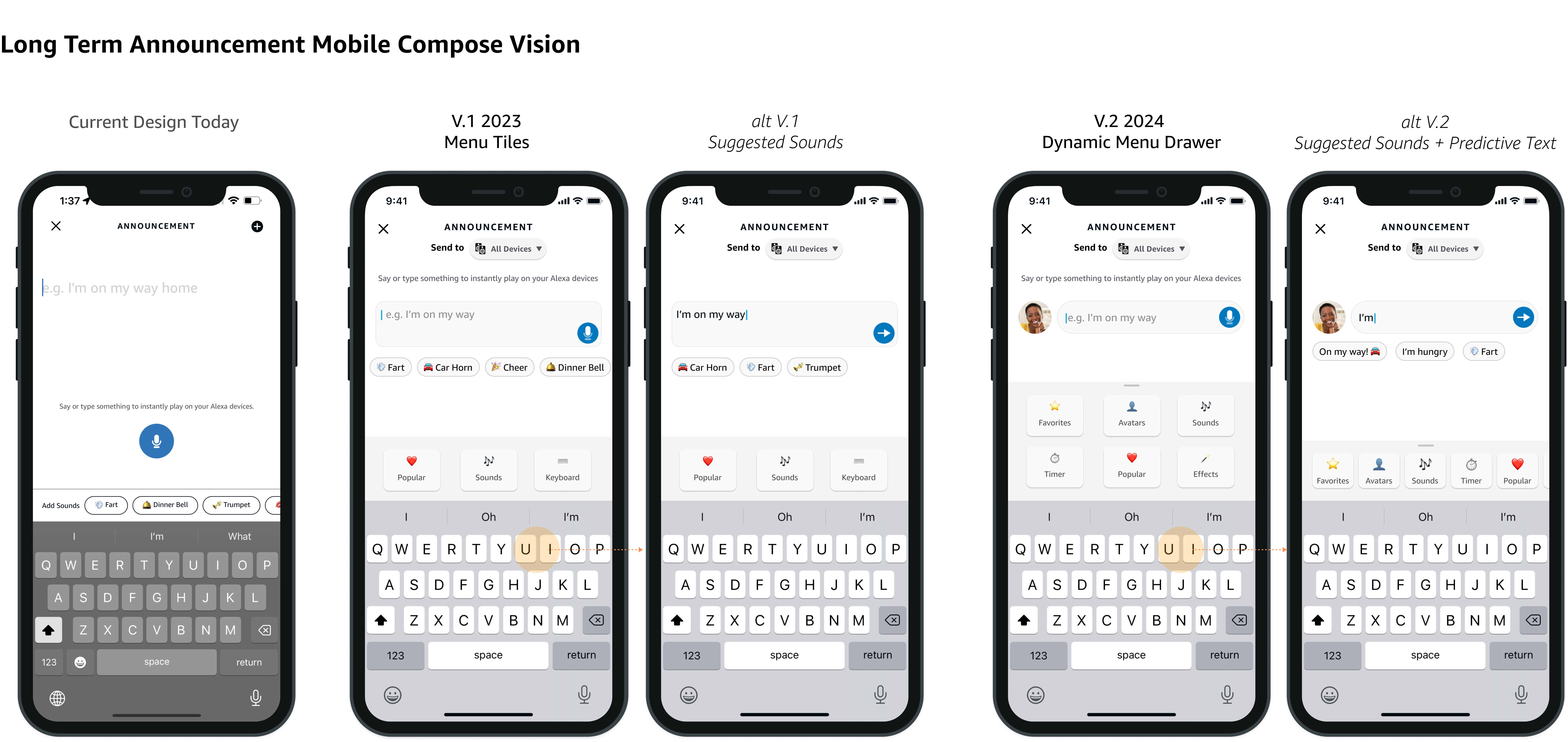
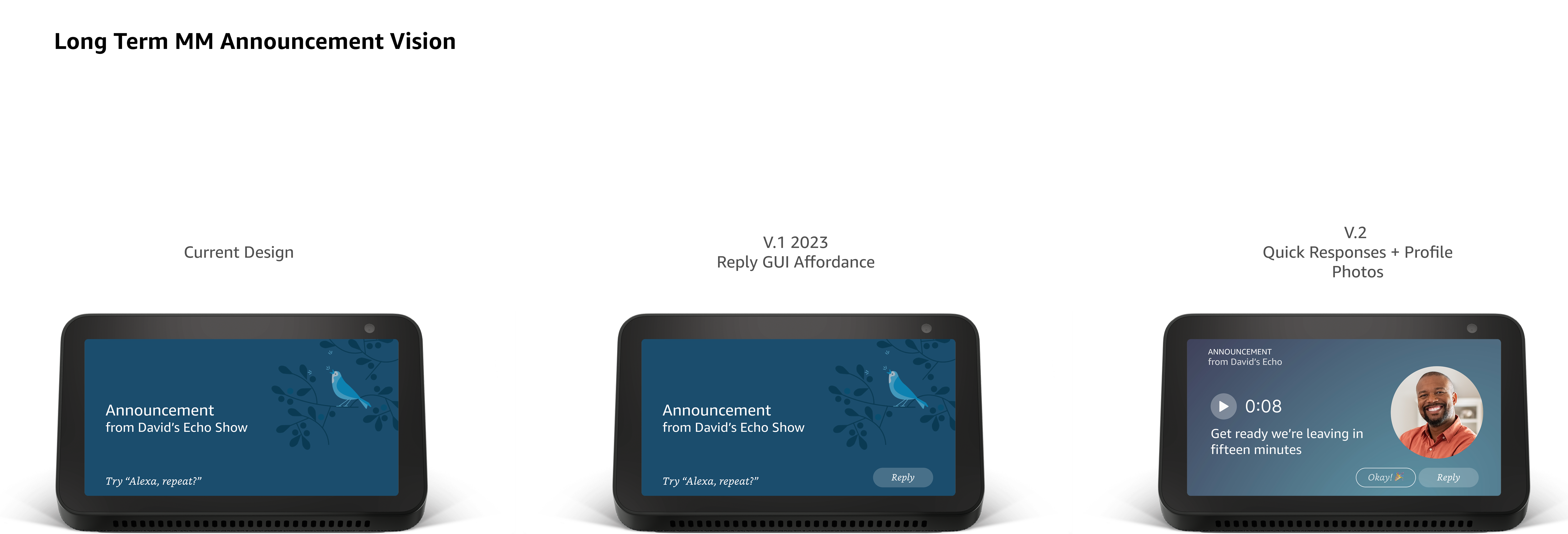
As a result, we came up with a loose game plan for how we can implement all of these new capabilities and then work backwards to incrementally add them to our experience. Below is a snapshot of our long term vision for both Mobile and Multi-modal and how we can get there with a phased approach.


We successfully launched the first phase of our Announcements redesign in the Mobile App as an minimum lovable product (MLP). This update introduced menu tiles for our existing features, Popular announcements, and Sound Effects, all built using the existing design system components. This launch represents the foundation of our broader vision for Announcements, setting the stage for future enhancements.